The global warming “pause” means different things to different people.
- Have the climate models overestimated the recent warming?
- Has global warming slowed down?
- Has global warming stopped?
All these questions are interesting and important, but this post will focus only on the last one.
Climate skeptic Christopher Monckton claims that global warming stopped more than 18 years ago. He bases this claim on a satellite temperature dataset from the Remote Sensing Systems company (“RSS” for short). Scientists have responded in various ways. One explanation is that lately, more heat has been going into the ocean instead of the atmosphere. Another is that other, land-based datasets (which do not show such an extended pause) more accurately reflect reality.
These sophisticated responses can be hard to evaluate without expert domain knowledge. Here, I’ll take a different approach: I’ll look directly at the RSS data, taking them at face value for this post.
It turns out that these data do not show an 18-year pause. The model that says they do is broken: to get the 18 warming-free years, it implicitly crams 18 years’ worth of warming into a single instantaneous jump.
Fortunately, the model is easy to fix. When we do, we find an apparent pause of 11 years and 6 months. This is short enough to be explained by natural variability, which means that any talk of a “global warming stopped” pause is at best premature.
But let’s begin by looking at the raw data themselves.
The raw RSS data
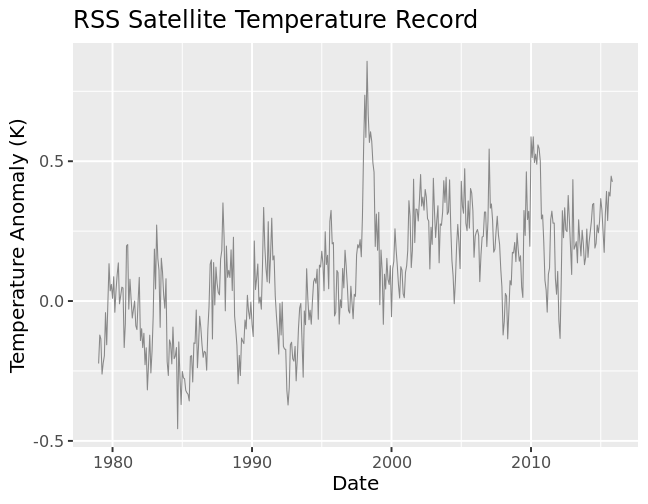
These data fluctuate—a lot. The fluctuations represent actual physical events, but for our purposes they’re just noise: we’re looking for underlying trends in the data.
Not much is clear at first glance. Maybe the later temperatures are overall higher than the earlier data? It’s hard to be sure by eyeball: what we need is a model.
We’ll try out different models in this post, using the standard linear least squares technique to find the best fit in each case.
The simplest model: one trendline
One approach is to assume that a single, constant trend can describe the data. That trend is the slope of the line of best fit: here, we find 1.22°C / century.
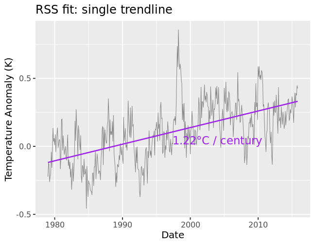
This model is exceedingly simple—and that is its strength! More complicated models risk mistaking noise for signal. This phenomenon is called “overfitting”, and we want to avoid it.
Of course, the downside to a simple model is that it may be too simple to capture important changes.
The next model: let the trend change
Suppose the underlying trend changes. Our model will still give an answer, but it will be wrong. We need a more sophisticated model to check whether the trend has changed.
(Note that it is very important to be able to detect trendline changes. After all, changing the trend is exactly what environmentalists are trying to do!)
In particular, Lord Monckton suspects that the trend has completely flattened (i.e., global warming has stopped). He looks for the longest stretch of time which yields a flat trend up to the present day, by the same method we used above (linear least squares). His answer is shockingly long: no global warming for 18 years!
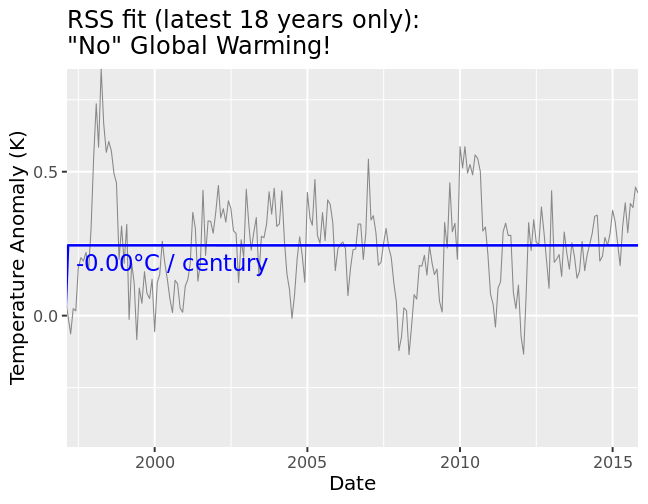
Actually, it’s not exactly the same method; he has excluded the earlier dates. When we add them back in, we discover a flaw in this model.
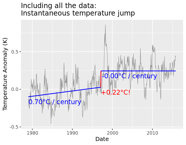
We do see that the slope has changed (from 0.70°C to -0.00°C / century). But we also see something else: the temperature instantaneously jumps1 by 0.22°C at the transition! This is not a small jump, either: it is equivalent to 18 years’ worth of warming at the single-trendline rate of 1.22°C / century.
So the 18-year “pause” really hides 18 years of warming in a single instant.
Fixing the model: trendlines done right
Everybody agrees that the real temperature trend doesn’t have any “jumps”. So why not bake this assumption into the model?
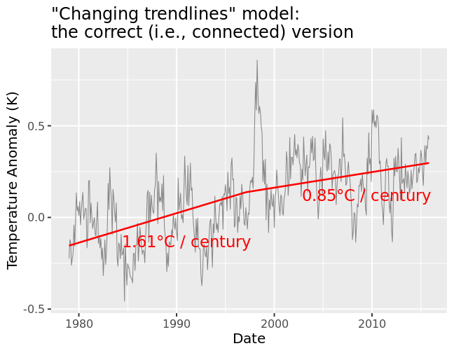
The improved model still allows the trend to change; it just makes sure to connect the trendlines. We see that the warming is alive and well: 0.85°C / century.
This is somewhat smaller than the average slope from the simplest model (1.22°C / century) However, it’s actually bigger than the biggest slope from the disconnected model (0.70°C / century)! This is another effect of squeezing all the warming into a single instant. The model underestimates the warming before as well as after.
What’s the longest pause with the fixed model?
We can play the same game as Lord Monckton, but using the fixed version of his model. How far back can we go and find a zero-slope trendline which connects to the previous trendline?
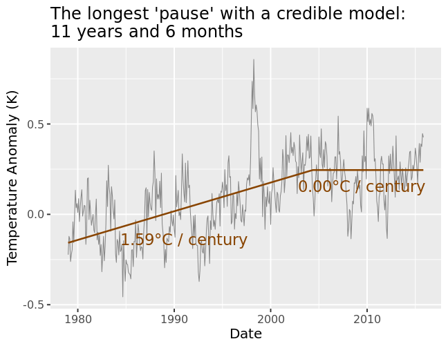
The answer: 11 years and 6 months. This is not completely negligible, but it’s a lot shorter than 18 years and 9 months.
In particular, it’s now well within the range of what natural variability can explain. Judith Curry (a climate scientist with climate-skeptic leanings) gives 17 years as a threshold to rule out explanations based on natural variability. Since fixing the model has “rewound the pause”, we are now well within that threshold. It looks like we’ll need to wait at least 6 years before we can claim that global warming has stopped.
Of course, that’s only if the data continue to “cooperate”. With 2015 shaping up to be a real scorcher, I doubt we’ll ever see a true pause (of this kind) materialize!
This unphysical temperature jump is implicit in other analyses (such as the escalator animation), but in this post I wanted to highlight it explicitly.↩︎